Wedding invitations hold an extraordinary charm when adorned with the perfect fonts. The choice of fonts is a pivotal element that significantly influences the overall aesthetics and ambiance of the wedding invite. In fact, with the right selection of fonts, your wedding invitation has the potential to transcend beyond the ordinary and emerge as a contender for the title of the most luxurious and visually striking one.
Below, we've meticulously curated a selection of wedding fonts that can elevate the appeal of your invitation, turning it into a work of art. Each font chosen is not merely a typeface but a carefully selected element intended to convey the elegance, sophistication, and unique personality of your celebration.
As you peruse through these fonts, envision how each stroke and curve contributes to the visual narrative of your wedding invite. Whether you lean towards classic, timeless scripts, or modern, chic sans-serifs, this collection aims to cater to a diverse range of tastes and themes.
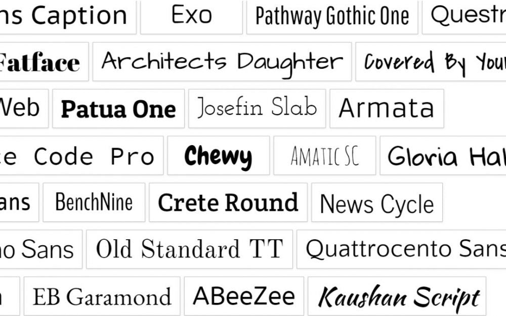
Google Wedding Fonts
Google fonts are just the best selection of fonts freely available on Google fonts website. Following are the most used Google fonts for wedding invitations:
- Great Vibes – Great Vibes is a beautifully flowing connecting script. It has cleanly looping ascenders and descenders as well as elegant uppercase forms. You can download it free from here.
- Charmonman and Charm – Cadson Demak is the first Thai communication design firm to develop type design solutions. Founded in 2002, the studio came together through a shared love of typography and design, a wish to expand and modernize the font industry as a whole, and the desire to make everyday use of type more accessible. They expanded from a modest design firm with dozens of their own typefaces into a boutique type foundry under the name Cadson Demak in 2008. Download charmonman font here and charm font here.
- Merriweather – Merriweather was designed to be a text face that is pleasant to read on screens. It features a very large x height, slightly condensed letterforms, a mild diagonal stress, sturdy serifs and open forms. It is a sturdy and well-designed serif font, featuring legible characters across a diverse range of weights and authentic italics. The font encompasses a comprehensive set of glyphs, indicating a professional construction. Download it here.
Merriweather was designed to be a text face that is pleasant to read on screens. It features a very large x height, slightly condensed letterforms, a mild diagonal stress, sturdy serifs and open forms. The Merriweather project is led by Sorkin Type, a type design foundry based in Western Massachaussets, USA. Download it here
- Lato – Lato is a sans serif typeface family started in the summer of 2010 by Warsaw-based designer Łukasz Dziedzic (“Lato” means “Summer” in Polish). In December 2010 the Lato family was published under the Open Font License by his foundry Poland, with support from Google. The semi-rounded details of the letters give Lato a feeling of warmth, while the strong structure provides stability and seriousness. “Male and female, serious but friendly. With the feeling of the Summer,”. Download it here.
- Forum – Forum has antique, classic “Roman” proportions. It can be used to set body texts and works well in titles and headlines too. It is truly multilingual, with glyphs for Central and Eastern Europe, Baltics, Cyrillic, and Asian Cyrillic communities. Download it free.
- Josefin Sans – The idea of this typeface is to be geometric, elegant, with a vintage feeling, for use at larger sizes. It is inspired by geometric sans serif designs from the 1920s. The x-height is halfway from baseline to cap height, an unusual proportion. Download it free.
- Montserrat – The old posters and signs in the traditional Montserrat neighborhood of Buenos Aires inspired Julieta Ulanovsky to design this typeface and rescue the beauty of urban typography that emerged in the first half of the twentieth century. As urban development changes that place, it will never return to its original form and loses forever the designs that are so special and unique. The letters that inspired this project have work, dedication, care, color, contrast, light and life, day and night! These are the types that make the city look so beautiful. The Montserrat Project began with the idea to rescue what is in Montserrat and set it free under a libre license, the SIL Open Font License. Download it free.
- Kalam – Kalam is a handwriting font family that supports the Devanagari and Latin writing systems. Even though Kalam’s letterforms derive from handwriting, the fonts have each been optimized for text usage on the screen. All in all, the typeface is a design that feels very personal. Like many informal handwriting-style fonts, it appears rather fresh and new when seen on-screen or printed on the page. Kalam’s letterforms feature a very steep slant from the top right to the bottom left. They are similar to letters used in everyday handwriting and look like they might have been written with either a thin felt-tip pen or a ball-point pen. In the Devanagari letterforms, the knotted-terminals are open, but some other counter forms are closed. Features like these strengthen the feeling that text set in this typeface has been written very quickly, in a rapid manner. Download it here.
- Pacifico – Aloha! Pacifico is an original and fun brush script handwriting font by Vernon Adams which was inspired by the 1950s American surf culture in 2011. It was redrawn by Jacques Le Bailly at Baron von Fonthausen in 2016. It was expanded to Cyrillic by Botjo Nikoltchev and Ani Petrova at Lettersoup in 2017. Download it here.
- Playfair Display – Playfair is a transitional design. In the European Enlightenment in the late 18th century, broad nib quills were replaced by pointed steel pens as the popular writing tool of the day. Together with developments in printing technology, ink, and paper making, it became to print letterforms of high contrast and delicate hairlines that were increasingly detached from the written letterforms. Download it here.
Non-Google Wedding Fonts
Although google fonts offer a great collection of fonts suitable for wedding invitations, there are many non-google free fonts best suitable for wedding invitation as follows:
- Candlescript – Candlescript font have a script and italic style. The body text of Candlescript font has been designed with high details, precisely, smooth and flow, so it is suitable used as a logotype, custom typeface, tittle, header, or any kind of advertisements purpose. Candlescript font also very adaptable when combined with other fonts, wether it is a Sans sherif, Slab sherif, Sherif , Regular or Italic. It allows the Candlescript font to be one of the multi-functional display font option and it will surely beautify your layout and looked very professional. Download it here.
- Invitation Regular – Best suited font for writing printing matter or wedding invitation wording in normal form. Download it free.
- Aphrodite Regular – Best suited for writing stylish printing content. It’s the best font on script font category and used by many professional wedding invitation designers all around the globe. Download it free.
- Baroque Script – Another font for writing stylish printing content. This font great for writing highlighted content in beautiful script form. Download it free.
- Cherry and Kisses Personal – Best font for highlighting printing content for strong intent and good impression. Download it free.